Practical Visualization, UX Australia 2014 Presentation
About this post
This post is about my first presentation in the international design conferences UX Australia 2014.
UX Australia 2014
Sydney, Australia, Aug. 2014
Here is my post-conference readout in Citrix internal design sharing session, including:
- Where the idea came from,
- Official presentation in conference, and
- Learnings in this experience.
The descriptions under slides were my verbal speech scripts.

About 6 months ago, I received a special email.

The paper I submitted to UX Australia has been selected and I was going to present in the conference.
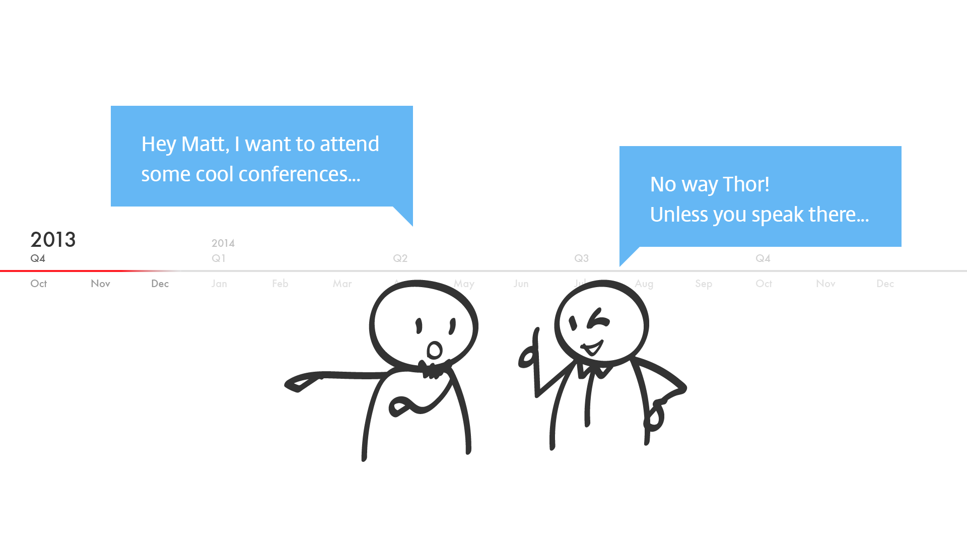
The story began on last year. Matt told me the only way to attend a conference is speaking there.

So I worked for it and fortunately it came out well.

But I was so busy on dedicated projects and innovation program that there is no time to prepare. For those don’t know me, I’m Sr. Product Designer working on Receiver in-session now.

Until last month, I realized that I really need to get started, and then all my personal time was thrown into it.
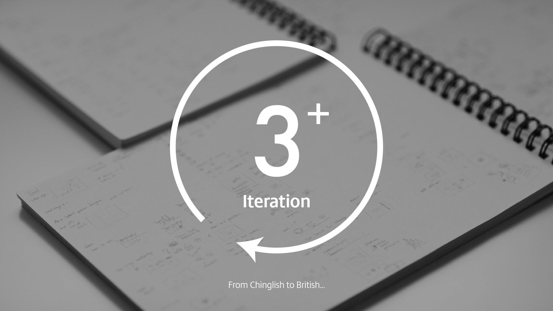
Lot of sketches and many iterations, Matt was also my personal coach to help me re-structure the presentation and correct my poor language skill from Chinglish to British.

Then the due day came…

The coordinator put me in the biggest ballroom. 10 mins before the presentation, I could feel my heart beating too quickly.

So I decided to take Sarah’s suggestion: taking a shot before I talk.

Then here we go…
*** Conference presentation starts here ***

2 days ago, I took 24 hours trip to travel from San Francisco to Sydney.

As a hybrid designer, I deal with many visualization tasks. I’d like to share my experience and methodology to you today. Since I am talking about "practical visualization"…

…my ambition is let you utilize simple geometrics…

…and make good use of typography to visualize the data or information you want to communicate.

My methodology is pretty straightforward:
(1) Identify the problem we try to solve by using design brief
(2) Understand and organize the data, information, or concept through analysis,
(3) Make a decision on an appropriate format for the presentation.

No matter what we call it…

…basically we just want to clarify what's the problem we need to solve.
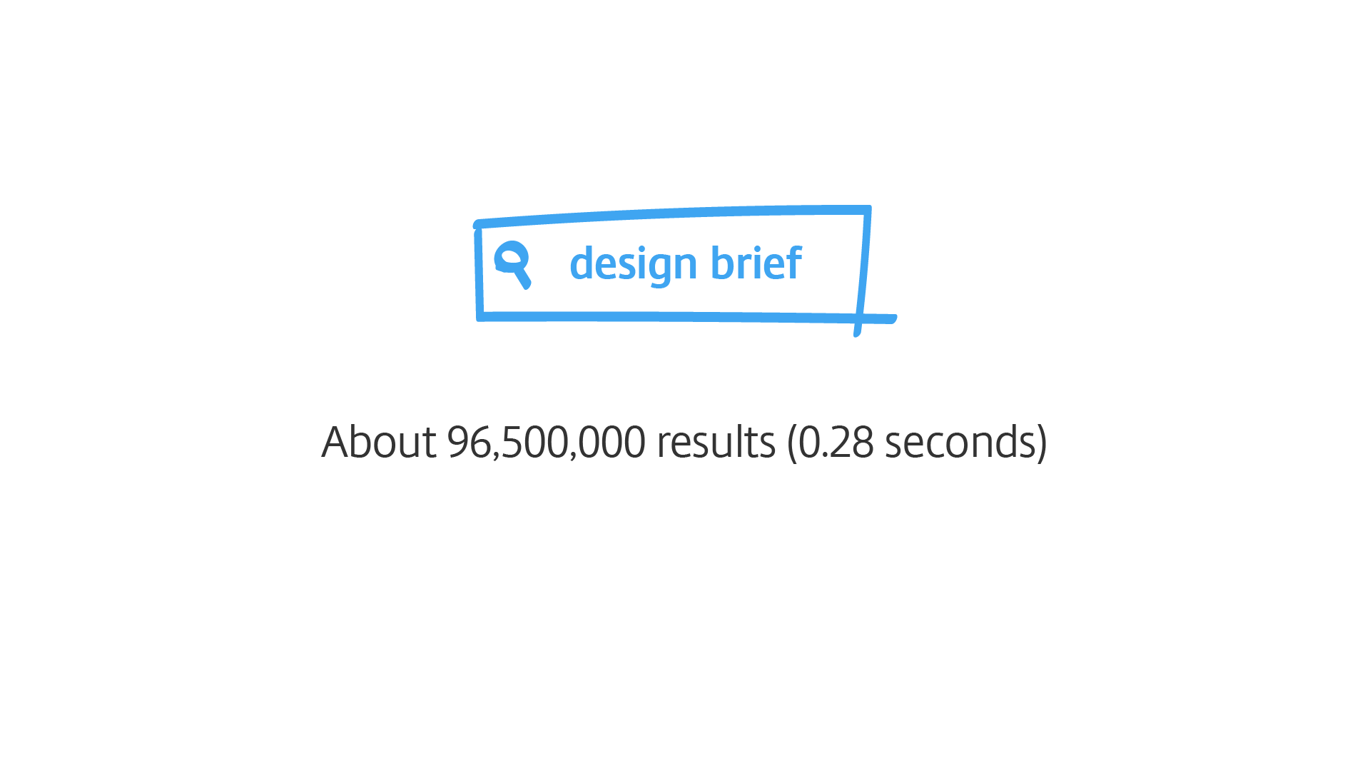
If you Google it, you can find millions of templates or articles about it. But to be "practical" and efficient, I usually ask myself only 4 questions:

(1) What's the goal I want to achieve?
(2) Who am I talking to?
(3) What's my central message?
(4) Where and how I need to present it?
Let's do a quick practice.

My goal today is to share the method I use to visualize information into an easy to understand format.

Attending this conference, I’d assume you are in UX relevant fields and interested in visualization.

The central message is to simplify the visualization process.

And I am presenting at a design conference using presentation slide format.

Then, we can compose a sentence like this, which also becomes the measure of success.

Second, analysis.

What do we need to visualize? Maybe it is a sales report, or maybe results from a research study, or maybe a concept or a design proposal?
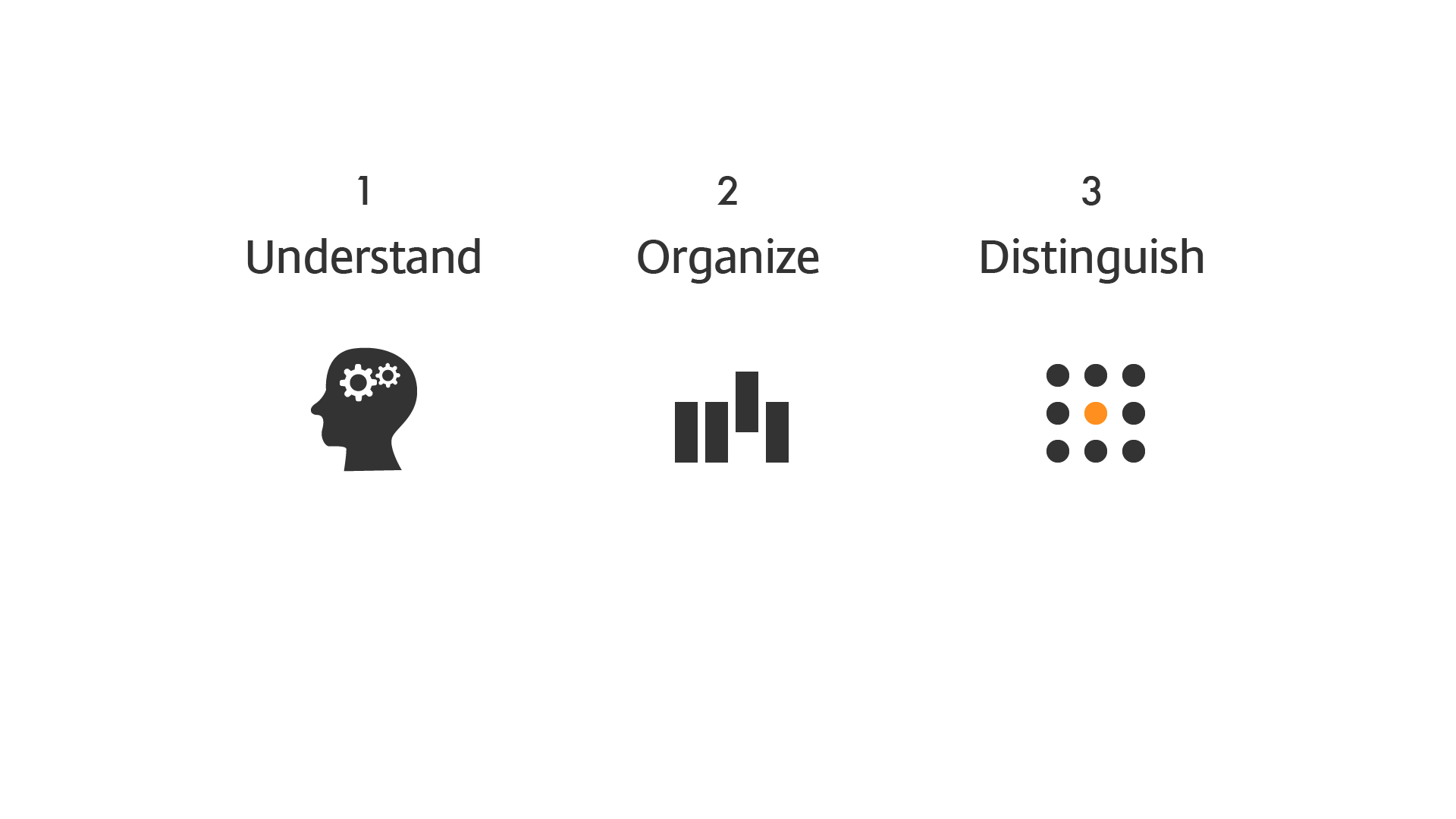
Whatever it is, figure it out. We must to well understand the background in order to tell a good story.

If I am not familiar with the background or subject, I simply ask lot of questions.

Richard Saul Wurman developed an inspiring framework which help to organize information, and he called this LATCH:
(1) Location,
(2) Alphabet,
(3) Time,
(4) Category, and
(5) Hierarchy.
Apart form alphabetic, which varies across languages, the rest of these are very easy to understand. I will show you some examples of my works to illustrate these in more detail.

First, location, very straightforward, right? Information can be visualized to reflect space or distance, using something like a map.
This one shows data center locations.
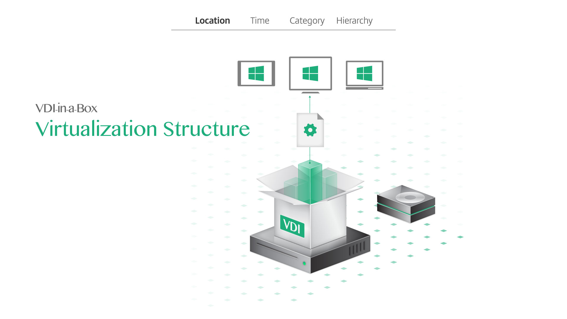
Or the location could be more abstract.
This was an example used to explain one of the Citrix virtualization products, and I used the box as a metaphor.

The idea is to visualize the installation steps for IT administrators to follow easily.
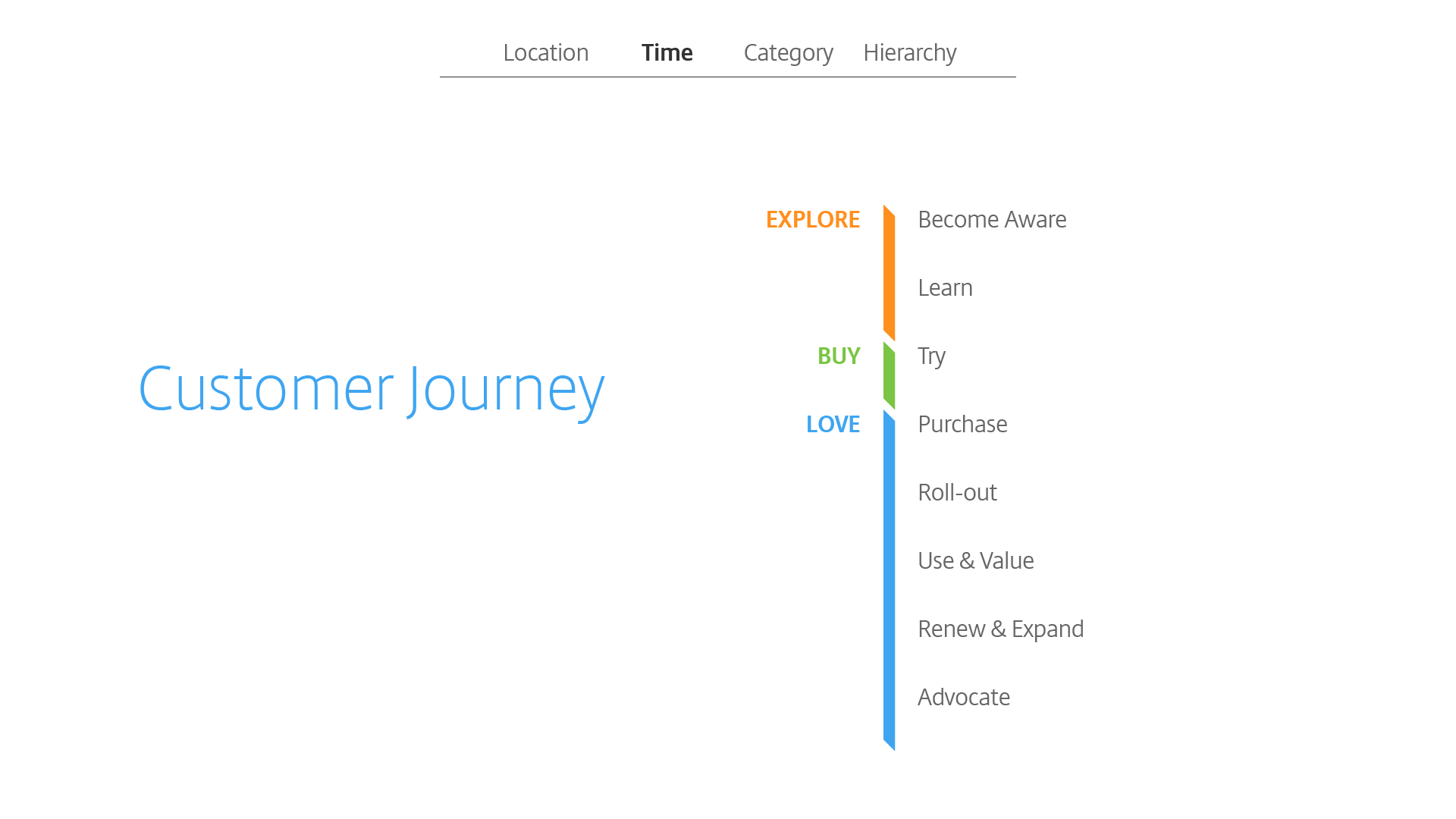
Next, time, such as timeline and road map, those can be organized along with timeframe.
This's our customer journey that was divided into 3 major segments and 2 of them have multiple phases.
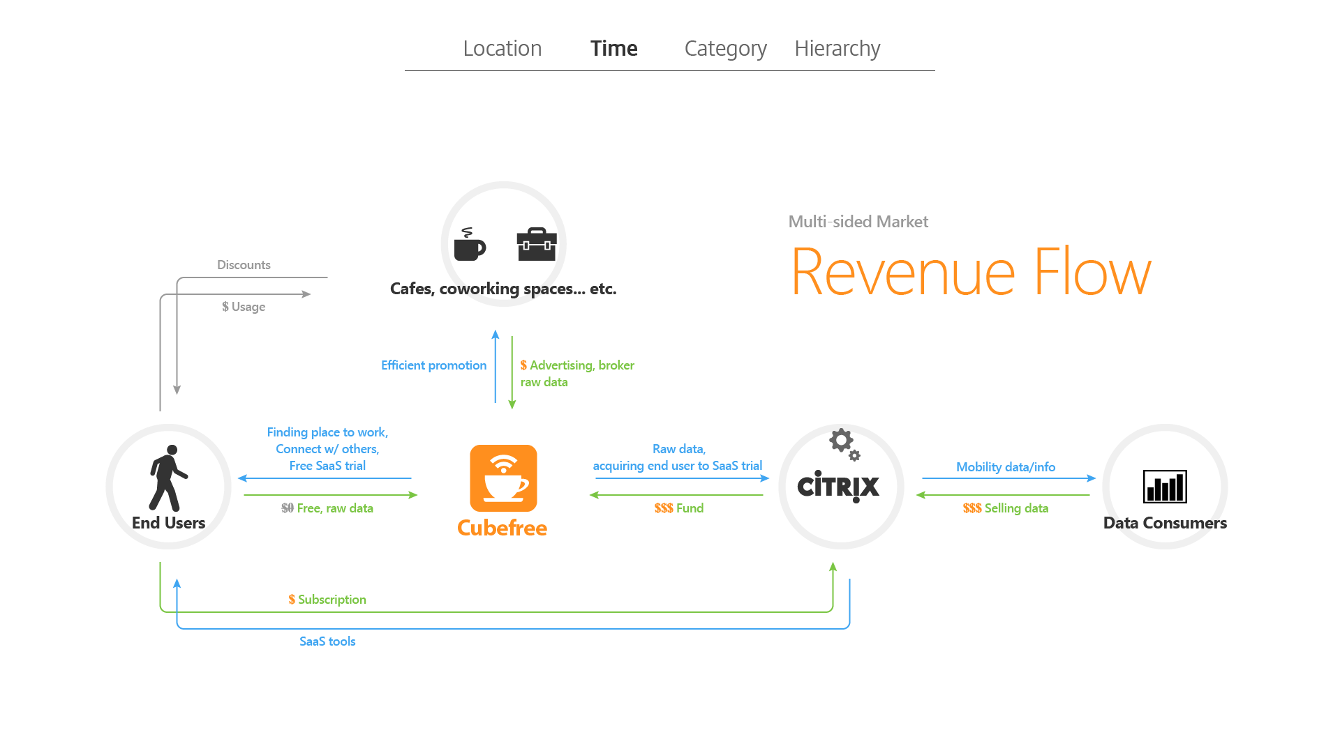
Flow chart belongs to this group because it's sequential.
This's a revenue flow of an mobile app that we show the transactional sequences between users and business.
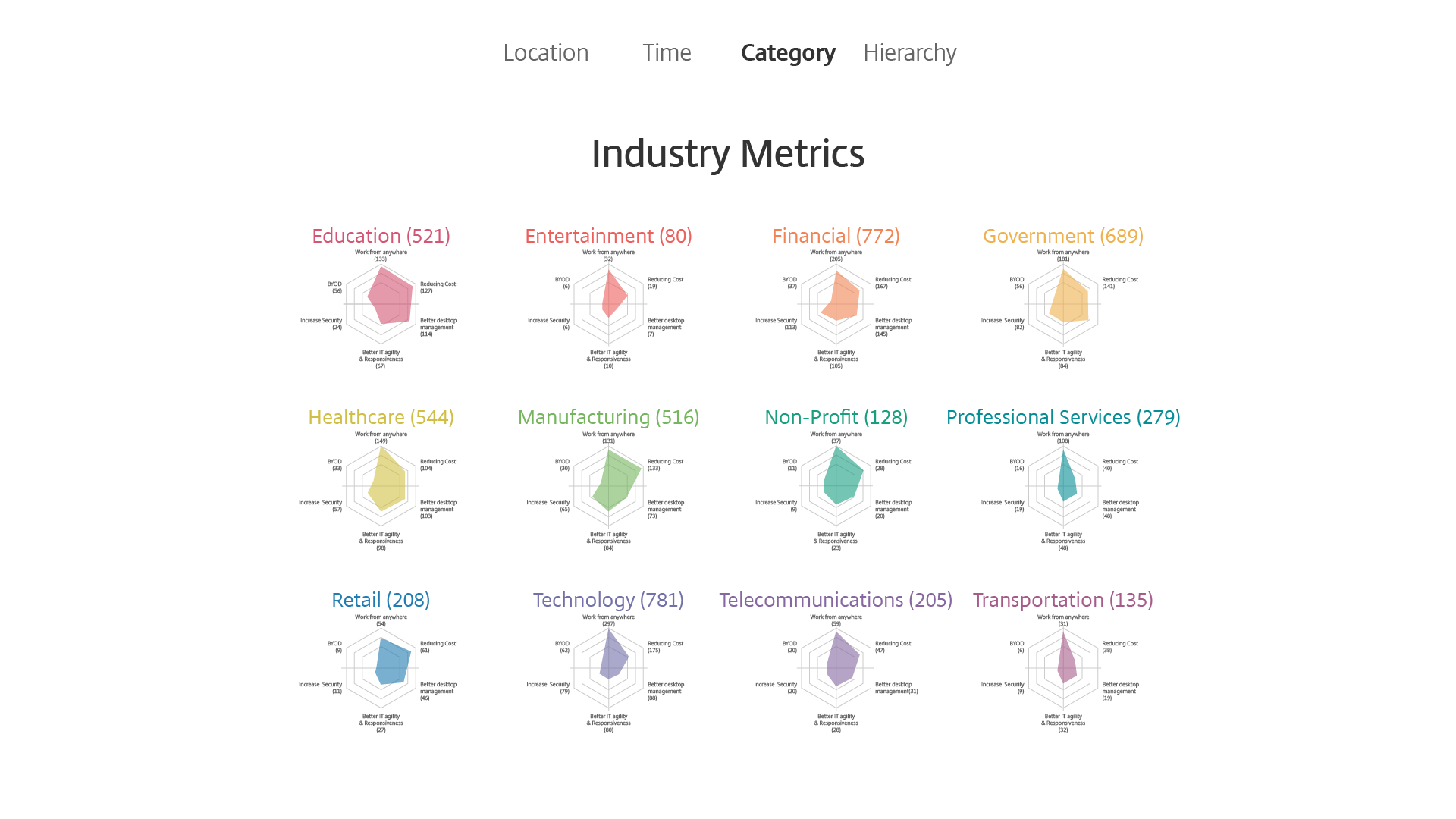
Next, category, which is helpful to create order and make information more consumable.
Here I've used spider charts to illustrate data from different verticals.

Every chart represents data from many companies regarding IT priorities.

We can also visualize the personas in an organization.
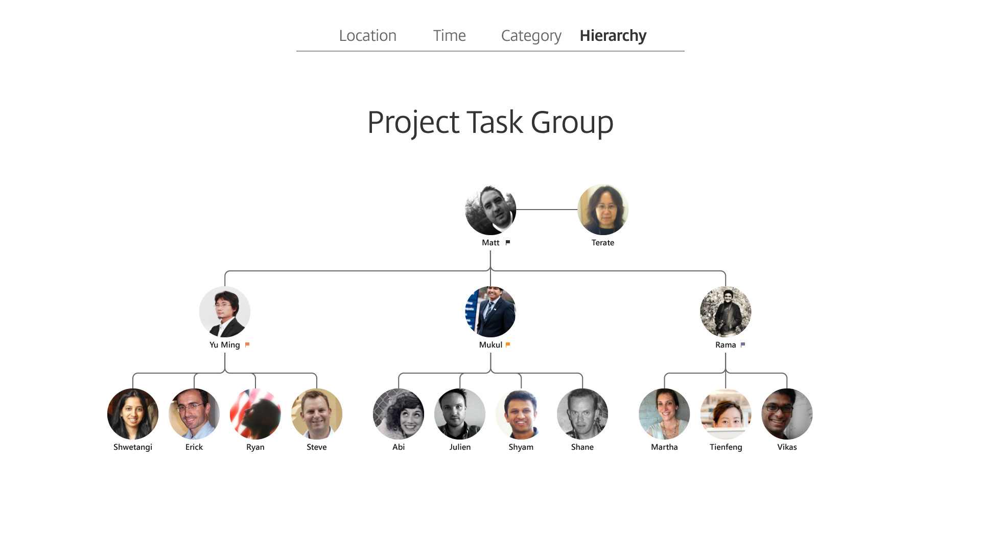
Next, hierarchy, data can be sorted in priority.
An tree structure is a typical example such as org chart.

Remember Maslow's Hierarchy of Needs?
Similar to that, this's the hierarchy of mobile worker needs on finding an ideal workspace.
OK, now, you have seen 4 methods and examples. But…

What if you need to combine multiple attributes? I tell you a truth: this happens all the time. Actually, this’s not bad at all. We can organize the information in various ways according to the story we want to tell.
Here are some examples.
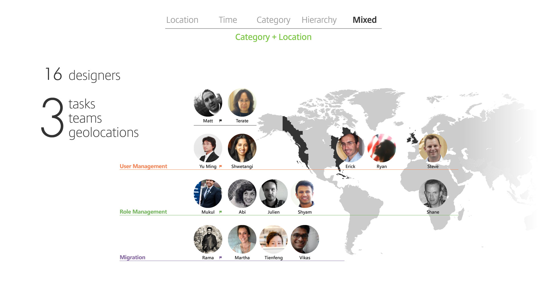
Category plus location: 3 teams, 3 tasks in 3 geos.

Next, location plus time.
This's the conceptual visualization which combines structure and flow.

Next, time plus category plus hierarchy.
This represents a customer journey and decision flow.
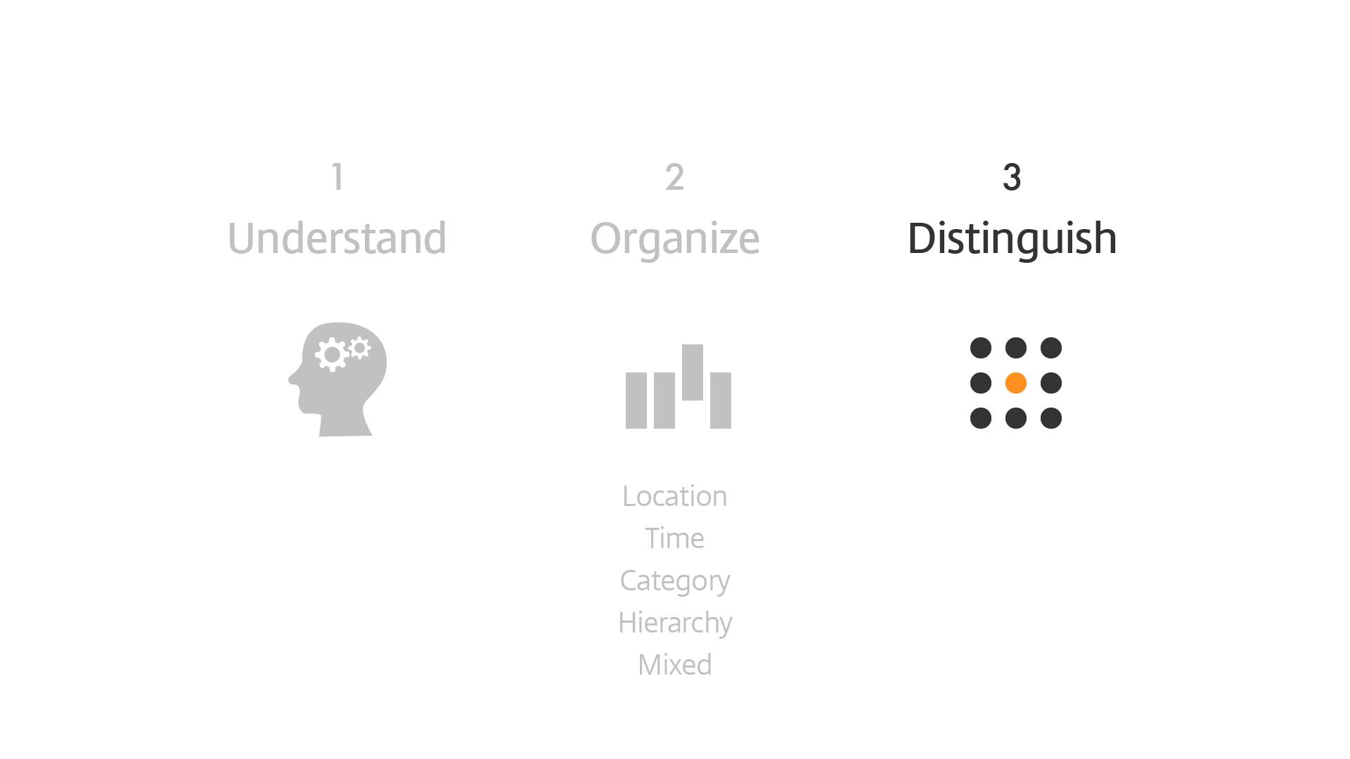
When we go through these 2 steps, usually we can also determine what's the key information for target audiences.
It is possible to highlight multiple messages from the same information and make it relevant to your audiences.

Distinguish the key information and deliver in the way they can understand.

Otherwise, our hard work would be wasted.
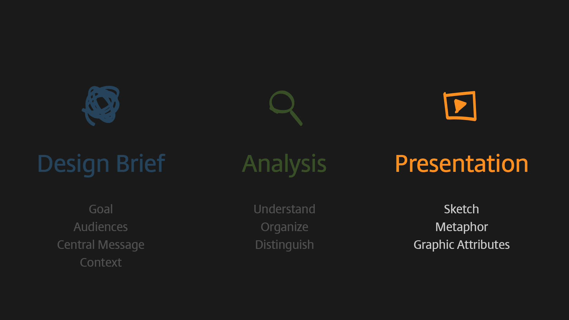
Third, presentation, in other words...

How do we visualize? This's hands-on technique.

To be "practical", we just utilize these 3 skills:
(1) Sketch the visualization in our mind,
(2) Sometimes try to find an metaphor,
(3) And the play around with graphic attributes.
What do you want to eat tonight? The first thing in your mind now is visualization.
Let me show you what I want to eat tonight.

Opps, not these 2 cute guys…

It’s lobster!

Since it’s the first time I am visiting Australia, I hope to share with the people I met today.
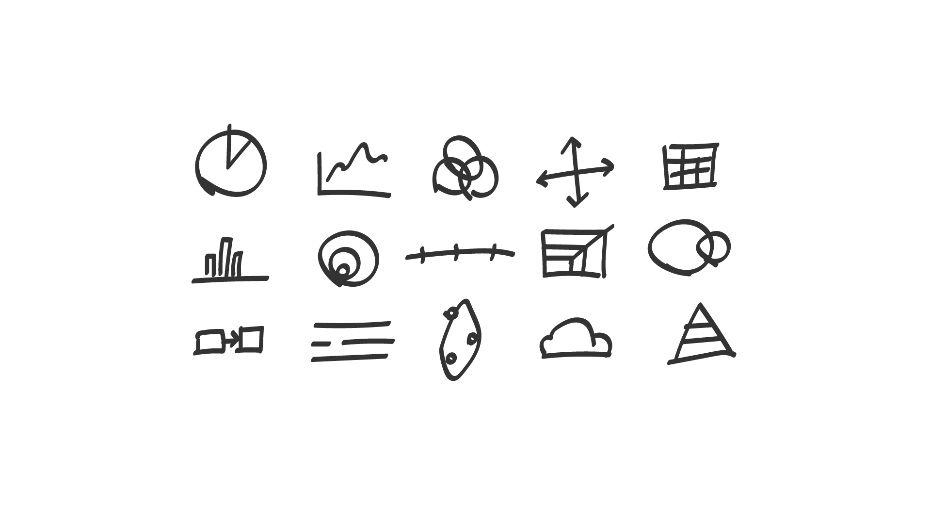
As long as we can recognize what we were drawing, don’t let the idea disappear. And we all can do it.
Since we are talking about food, let me bring an example of metaphor.
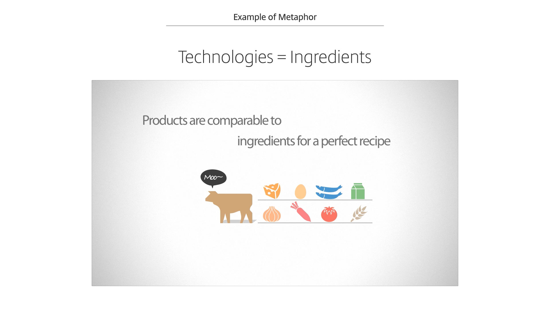
In the IT industry, one of the challenges is customers sometimes can be confused by technology choices.
In one project, we explored this concept: Technologies are represented as ingredients…
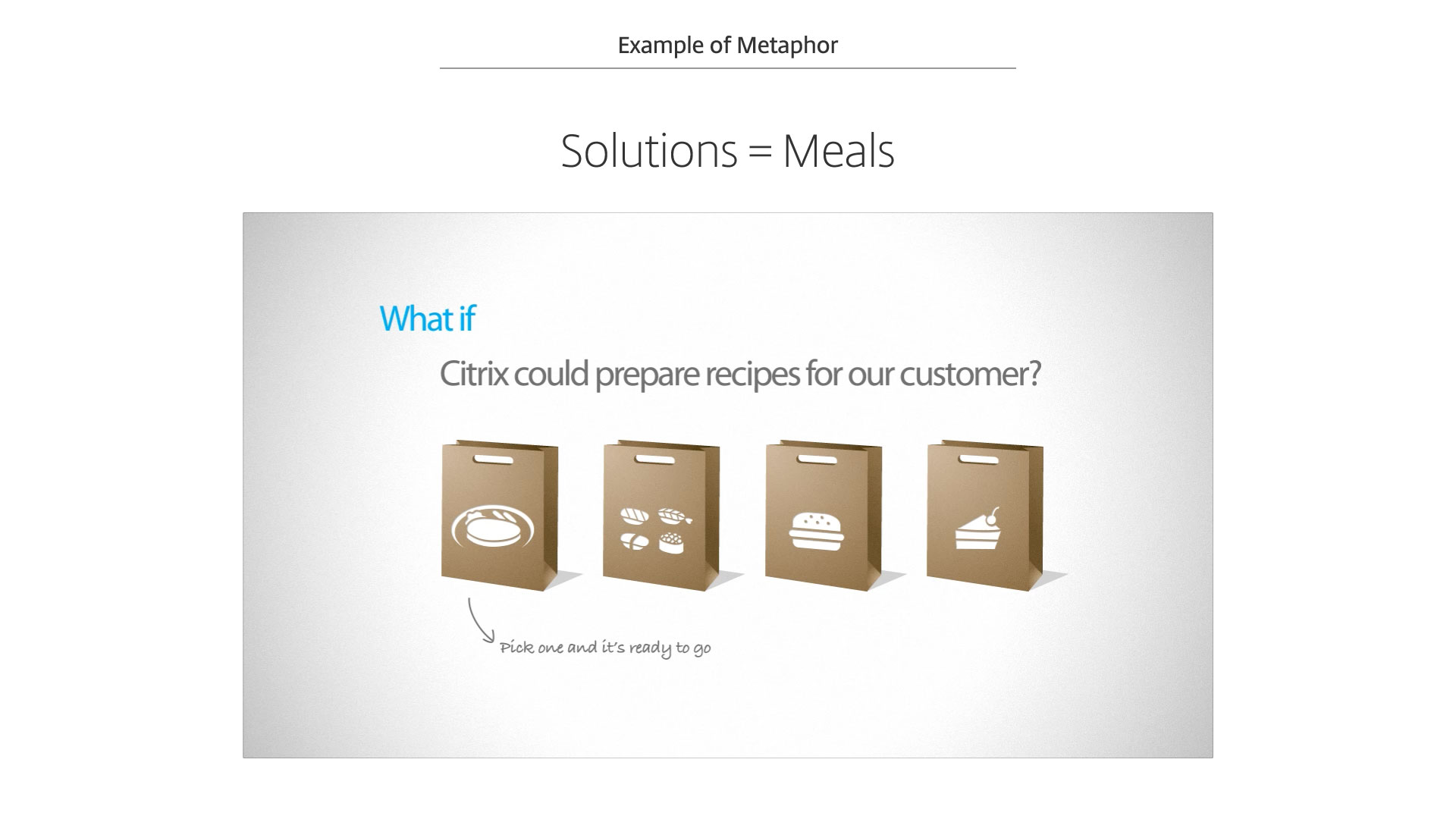
…we cook for customers and deliver meals according to their needs.
But be careful about metaphors, it might not work if we use wrong one.

Look this example. I literally used ingredients to represent different technical components and it’s way to complicated,...

Un! No one can really understand.

Very quickly, we come to the core of graphics skill. Graphics is a big topic and it’s impossible to go through it in one presentation. To be "practical", I simplified it into only 3 attributes...

Shape, color, and texture.
I use different shape to represent information and context. Then differentiate or highlight the key elements with color, and add texture to the elements if need.

Line, the simplest shape. With line, we can draw timeline or use to separate groups.
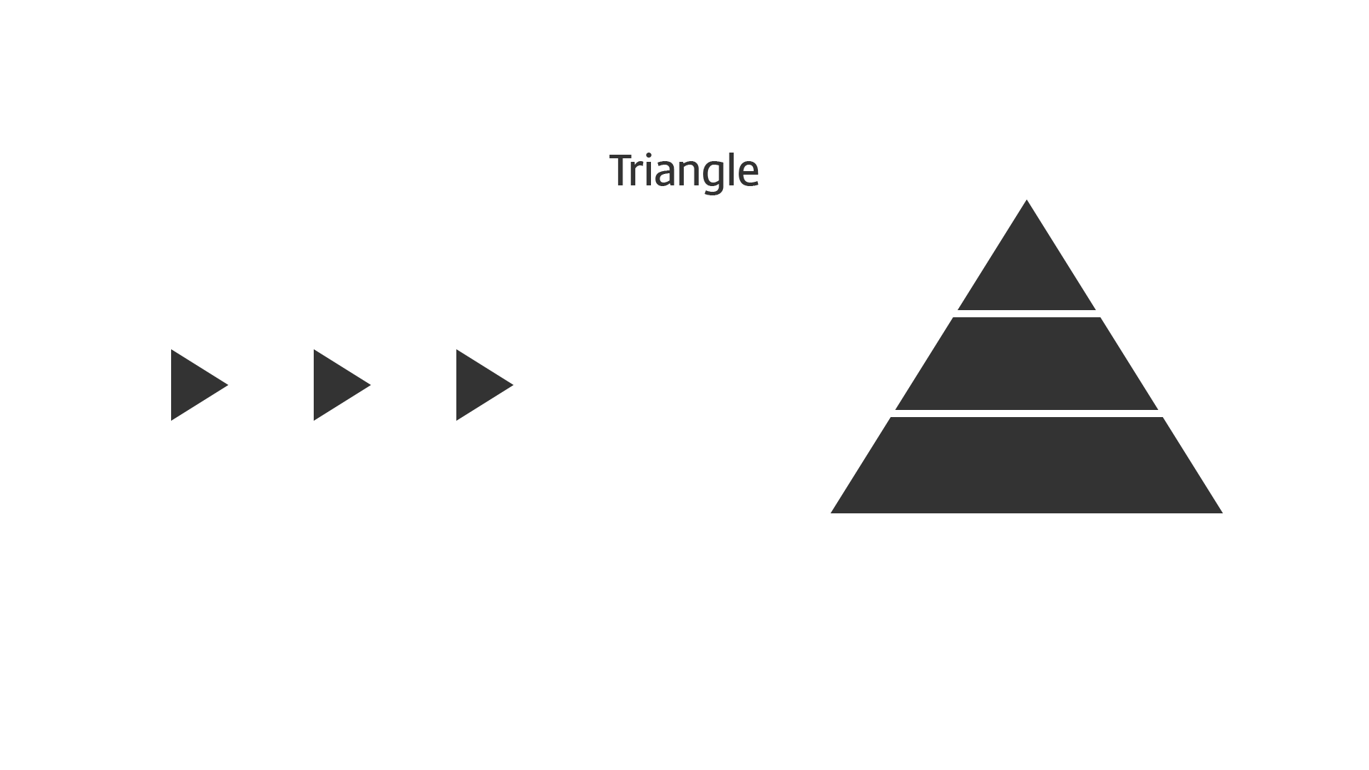
Triangle could be the hint of progress, or divided into couple pieces as structure.

Circle can be as small as a dot, represented as amount of objects, or as big as a pie chart or Venn diagrams.

Rectangle, could be boarder lines as bar chart or stack structure.

So, do you want an iPhone? You can make it.

Here you go.

Shape can be the object or context. If we want to tell a story about cloud computing or bottle water, we can utilize the shape.
Well, if I am not a visual designer, how can I make it?
No worry! There are bunch of great resource we can use. However, sometimes we even don't need to draw…

…because the number or text talks itself.

Check this example, highlight the number itself is good enough to tell a story, especially when we don't have time to make things pretty.

Or add some rectangle to make the simplified bar chart. I add texture in the background to pop up the color. You can see I visualized the complaint from the team, too.

Font itself presents emotion.
From top to bottom are my favorite fonts. The size is the usage, the bigger, the more frequently I used. Sans-serif fonts have higher readability in small context or screens.
Gill Sans is kind of humorous and I love the “i” letter, so cute.
Helvetica Neue is awesome. Sorry I am old kind of school. Unfortunately it looks sort of pixelated when not presented in 100%. So I sometimes use Myriad Pro instead.
Futura looks nice in numbers.
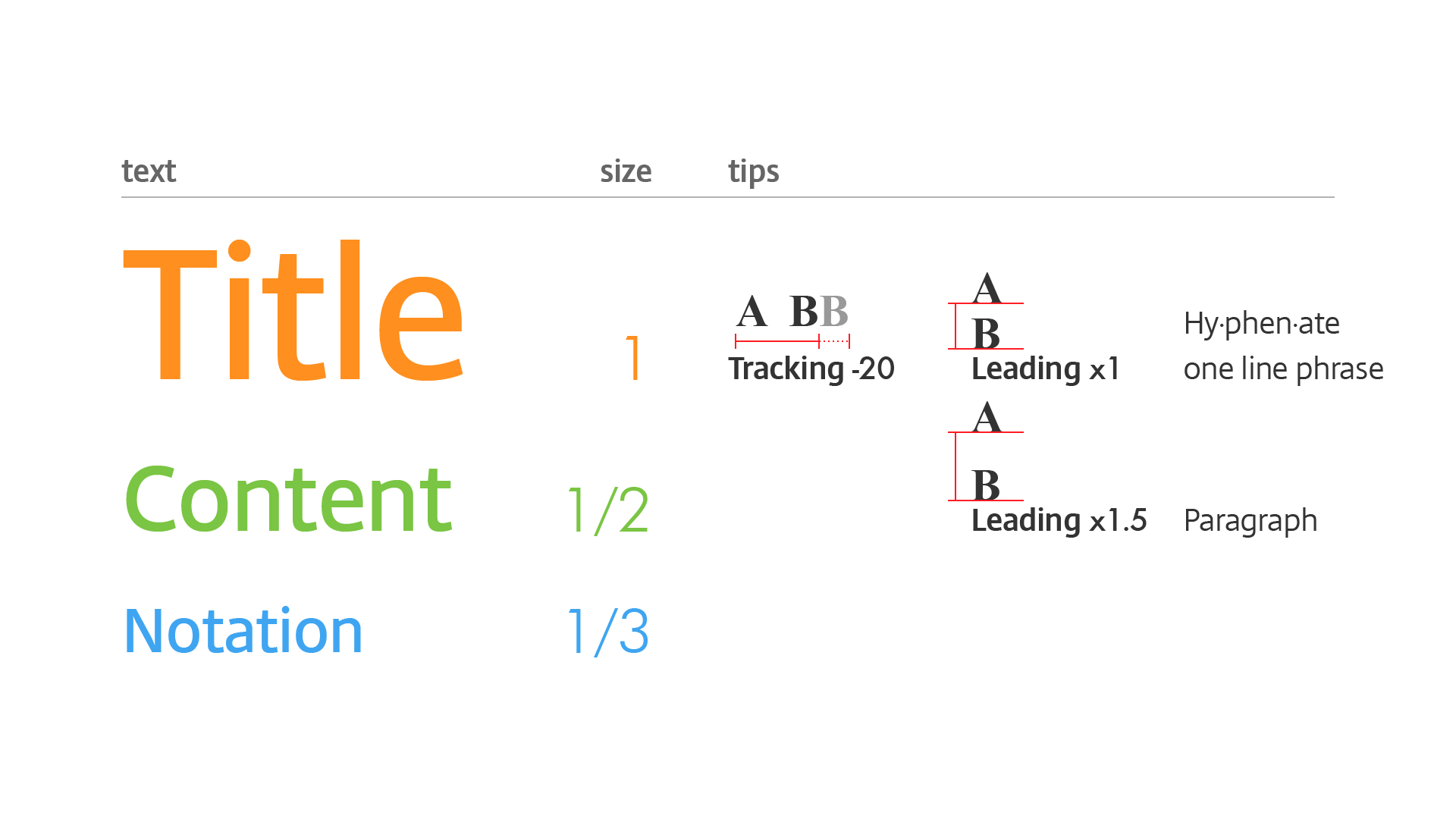
Learning typography is fun but might take a while. Here are some of my tips:
For example, in a presentation slide, I usually make the content font size as half of title. Notation could go smaller, so that there is some clear ratio behind.
For relative bigger size font, I prefer to shorten the gap between letters. Also, adjust the gap between lines accordingly.

Now we have so many elements: geometrics, icons, text, and numbers. How do we arrange them?

I use grid.
To be “practical”, we just simplify by dividing the canvas into 3 or 4 or 5 portions based on quantity of elements, and then align them along the lines.

We know the reading habit in most of the countries is from top to bottom and from let to right.
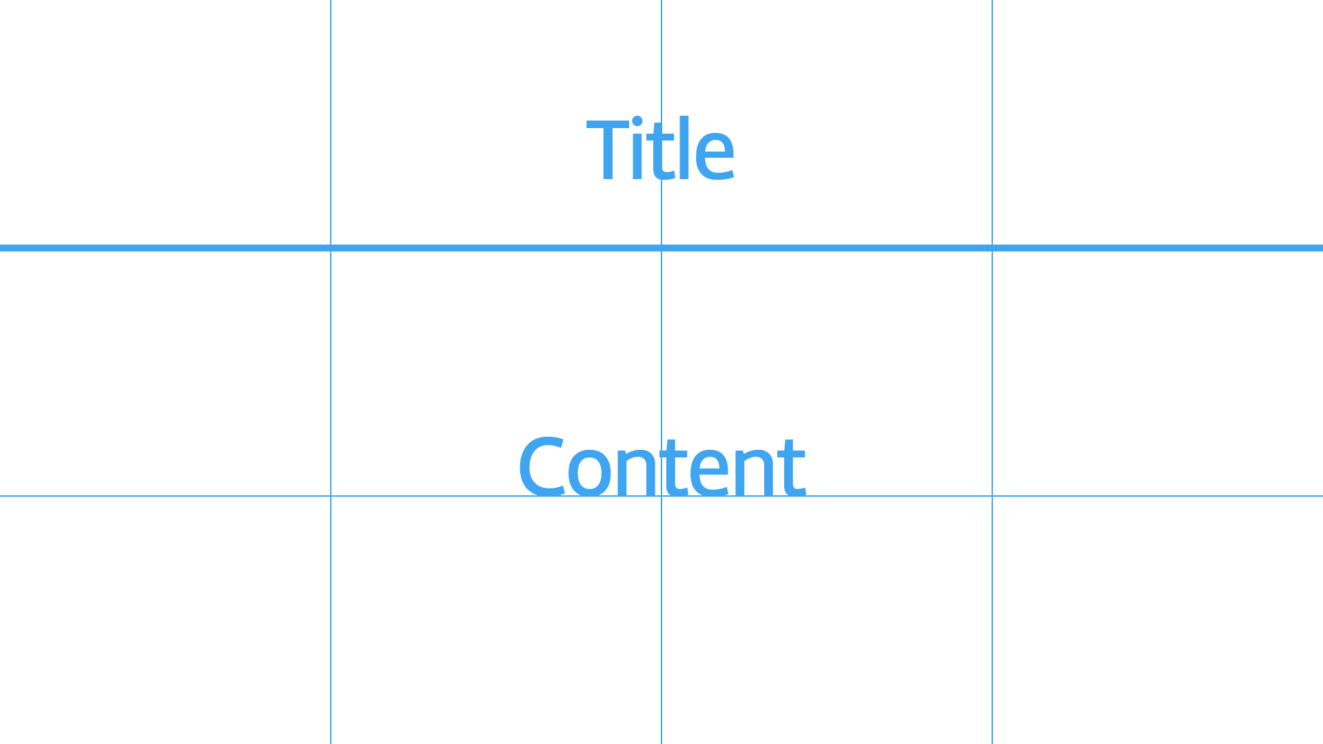
So the title and content could be arranged like this…
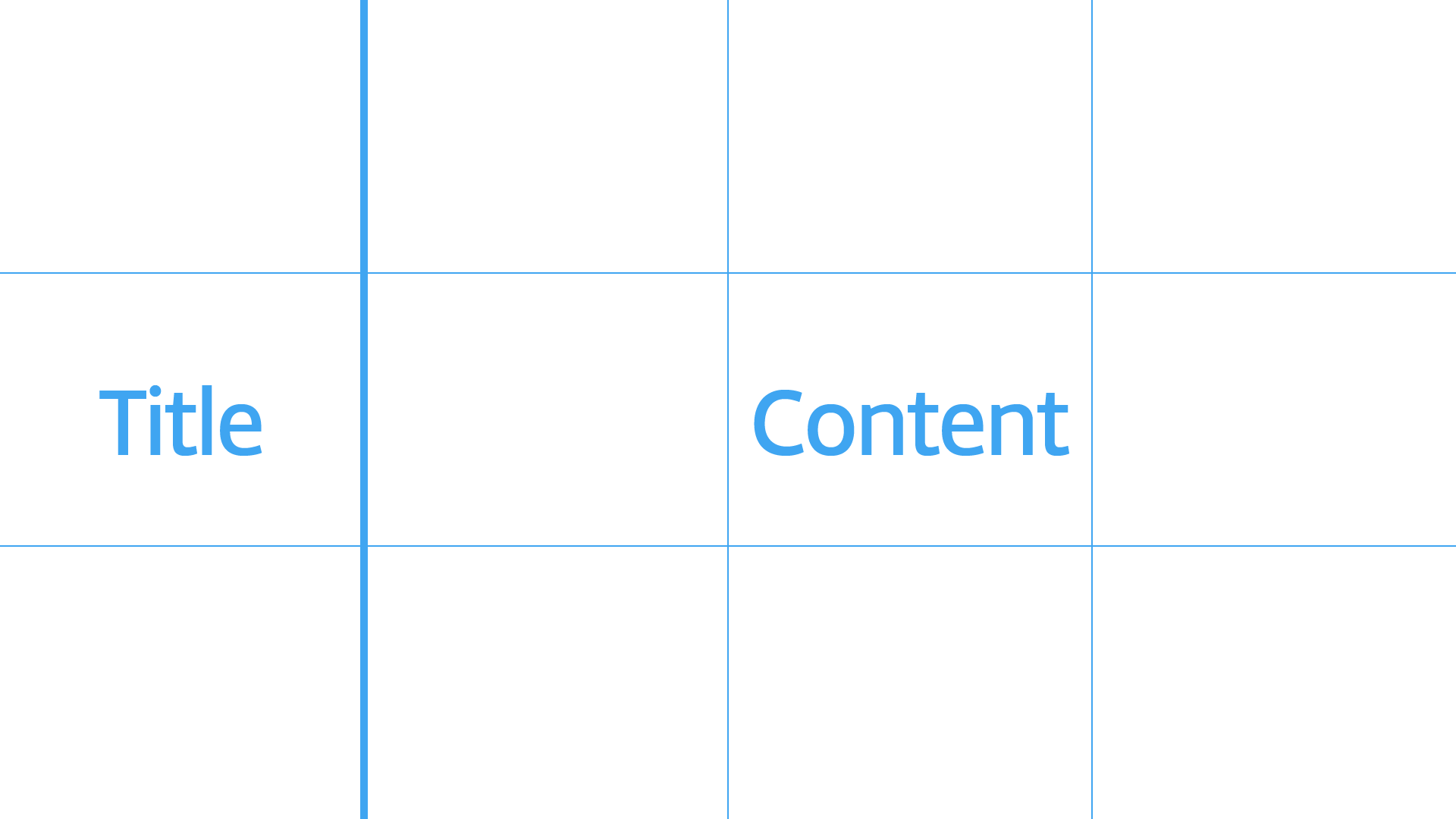
and that.
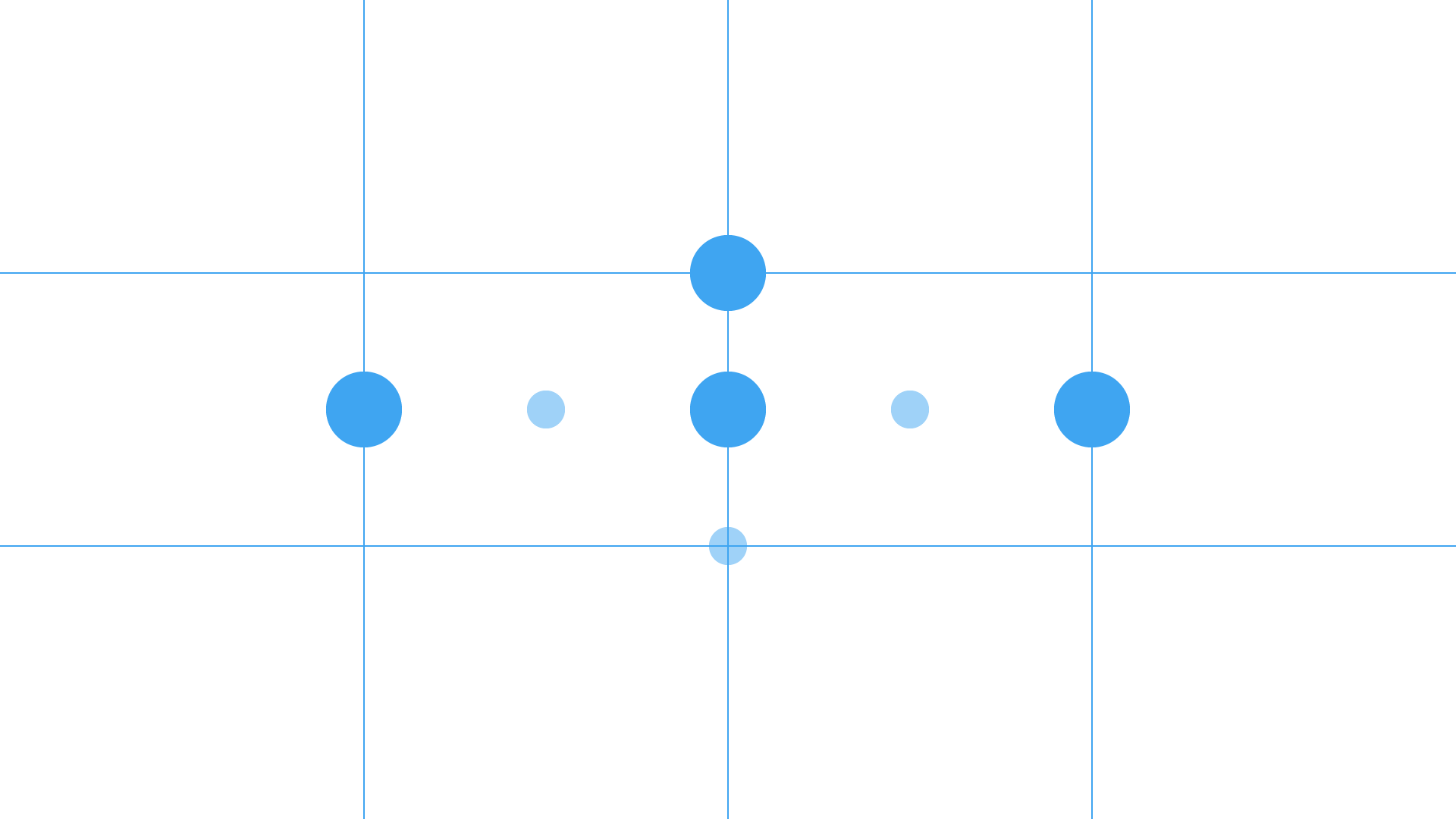
And the key elements can be placed in these locations. Bigger dots are my preferred spots.

Then we’d like to emphasize the key elements with contrast by size and/or color.

Color, could be more complicated than any other theories in graphics.

To be “practical”, again, I recommend a Japanese color system: PCCS.

Just remember these major tones: vivid, light, dark, and grayscale. I believe you already catch the emotion from their names.

I prefer to pop up the key elements by colorizing in the vivid tone, just like this presentation.

Lot of good and classic examples we can learn online, such as London Tube Map.
But be careful about the color…
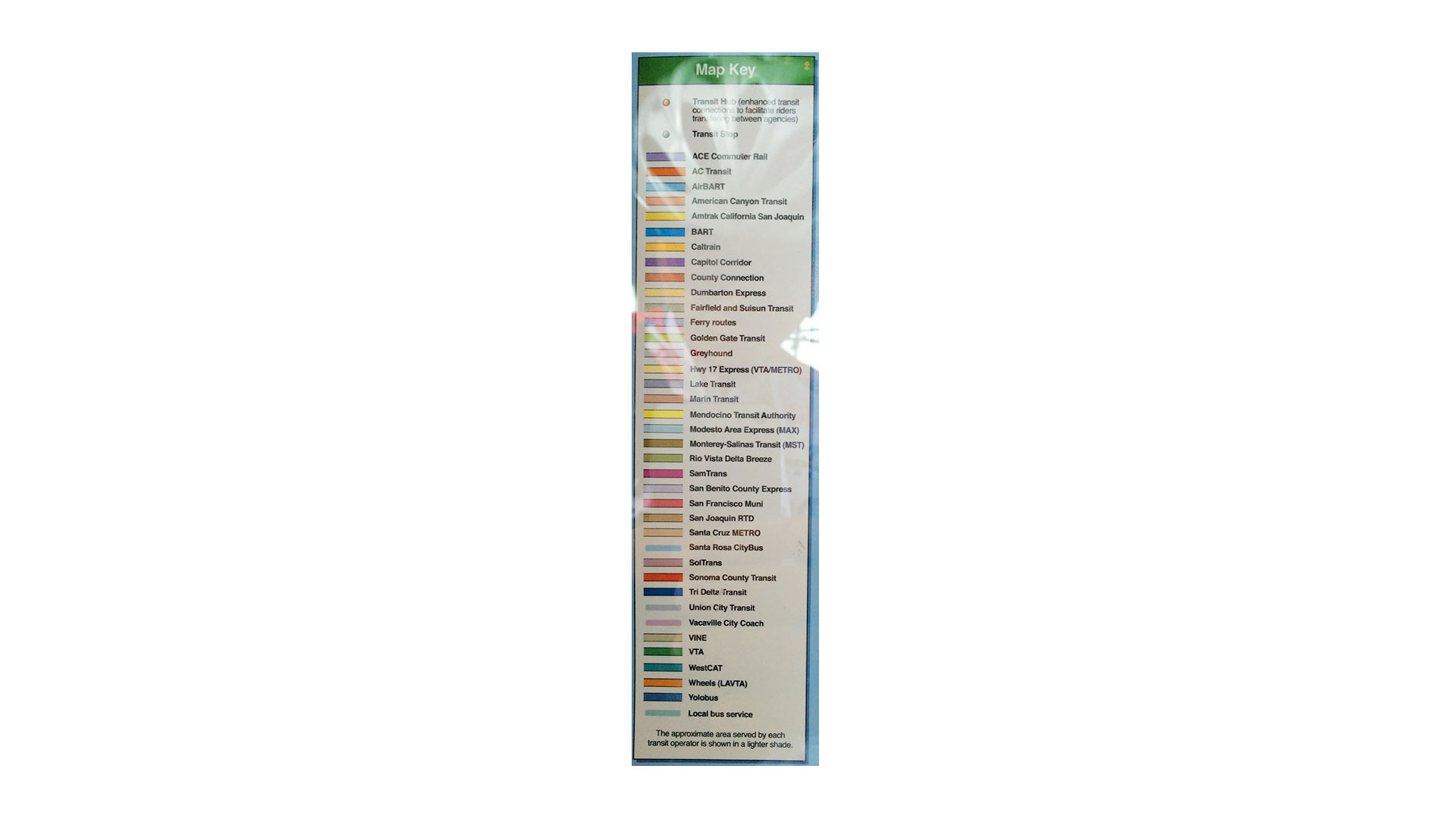
This’s an opposite example. I took the picture in a train station. This’s a legend of a map. The problem here is too many similar colors on it and it’s difficult to tell which one is which.

OK, I’ve shared a lot today. If you try to apply this in your day job, don’t be frustrated if you don’t get it right first time.

I have been doing this for 8 years and I am still learning. So keep iterating!

In conclusion, this’s my methodology on visualization:
(1) Identify the problem we need to solve,
(2) Understand and organize the information,
(3) And then show it in appropriate format.
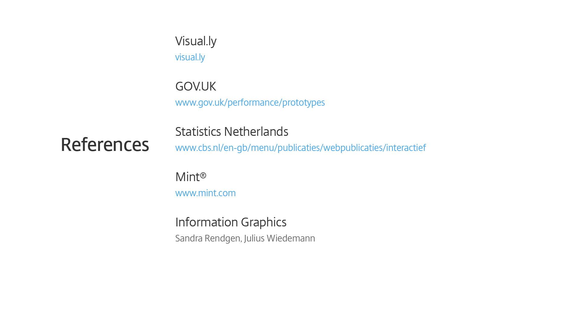
I assume you guys will have my slides after the conference, so I include some references and resources for you.


I’m Yu Ming Li. Friends call me Thor. I’m a Sr. Product Designer in Citrix. If you have any question about visualization, I’d like to help. Thank you.
*** Conference presentation ends here ***

How’s the feedback? It came out better than I expected.
Some people came to me proactively to say they like my presentation. Some suggested that I should slow down a little bit when talking about examples. The conference organizer Donna Spencer asked me to host a hands-on workshop next year for participants to practice. Anyway, I take these as feedbacks to improve.

In addition to presenting, I also attended other talks.

The topics were around there 3 points:
(1) Agile design process for lean UX
(2) Sketch badly is good, as long as it helps communication, and
(3) Some findings from neuroscience that can help in design process.

The conference was very diverse, covering many design perspectives and the speakers came from over the world with different backgrounds.

The content is inspiring. The format is amazing: many different type of activities including design game.

The most awesome thinking is this: they consider introverts, the people like me!

So there were pre-conference meet-ups, dinner groups, open house visiting, and post-conference party to help people get to know each other.

I made some friends around the world there.

And also did an end-users interview on Receiver in-session experience, which is the project I’m working on.
The last thing…

I’d like to thank those support me for the adventure. Definitely thanks God everything came out well!
Thank you!